A Scoreboard You Can Read From the Back of the Hall
Bigger type, stronger contrast, digits that never jump — plus your own colours and typeface on PRO.
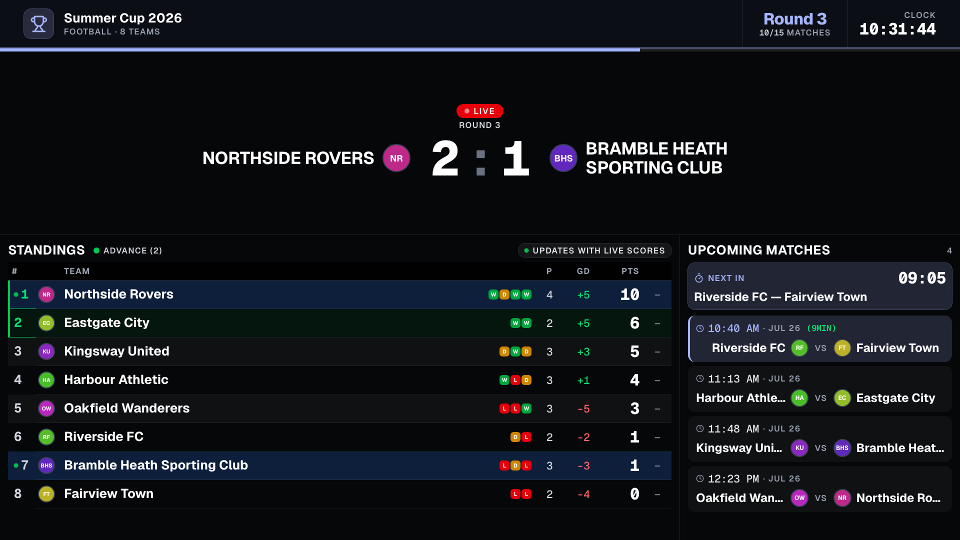
A TV is not a laptop, and it was being treated like one
The TV screen was built with values that make sense on a monitor an arm's length away: 16-pixel team names, 12-pixel column headers, muted grey labels. On a 55-inch panel across a sports hall, that is the difference between a scoreboard and a decoration nobody looks at twice.
So we rebuilt the type scale around viewing distance rather than screen width. Sizes now follow the height of the display, which means the board keeps the same proportions whether it runs on an old 720p projector or a 4K panel — no more text that shrinks into the corner on an unusual resolution.
Contrast got the same treatment. Every label, header and value on the board is now checked against the near-black background, with the same threshold broadcast graphics use for text people read at a distance. A couple of things simply failed that test before, including the round number in the header, which was rendering in a dark grey almost nobody could see.
The standings table earns its space
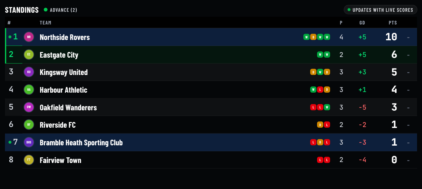
Standings are what people actually study between matches, so the table got the most attention. Rows are taller, team names and points are dramatically larger, and the header row now sticks in place while the table scrolls itself — before, a viewer reading mid-scroll saw a column of numbers with no idea which column was which.
Points are the answer everyone is looking for, so they are now the biggest, brightest thing in each row, aligned right in a face whose digits all share the same width. The qualification cut-off is drawn as a green edge on the left of each qualifying row instead of flooding the whole row with colour, and the ”top 2 advance” legend is always visible — previously it only appeared in group tournaments, which left everyone else guessing what the green meant.
One quiet but real fix: the table used to scroll twice. The panel around it and the table inside it each ran their own automatic scroll, so rows slid against each other. Now only the table scrolls, and it stops entirely if the viewer's device asks for reduced motion.
Your colours on the big screen
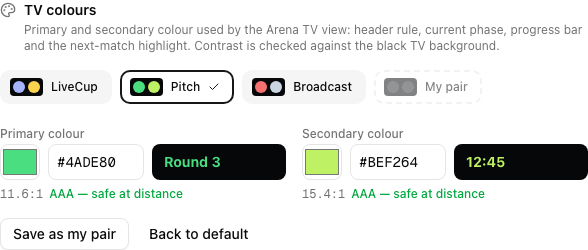
PRO organizers can now set a primary and a secondary colour for the TV view. The primary paints the header rule, the current round, the progress bar and the highlight on the next match; the secondary carries the elapsed-time readout. Everything else — the red LIVE badge, the green qualification zone — stays put, because those colours mean something and should not become brand decoration.
There are three ready-made palettes you can always come back to: the LiveCup pair, a green ”Pitch” pair for field sports, and a red-and-slate ”Broadcast” pair. Pick any of them with one click, or set your own hex and save it to a fourth slot, so trying a preset never costs you your club colours.
Every colour is rated for readability as you pick it, against the actual black of the TV background rather than the white of the settings page. You see the ratio and a plain verdict, and anything that would be genuinely unreadable across a hall is refused — a branded scoreboard nobody can read is worse than a generic one.
Four typefaces, including one that fits long club names
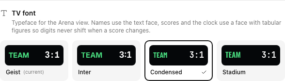
Type is the other half of a scoreboard's character, so PRO organizers can also pick the face. The default is exactly what you have today, so nothing changes unless you want it to. Beyond that: a neutral broadcast face, a condensed one, and a stadium-board display face.
The condensed option is the practical one. If your teams are called things like ”Sporting Club Wilanów II”, a narrower face buys you the characters you need in the standings column without shrinking the text or cutting names off with an ellipsis.
Each option carries two faces rather than one: a face for names and a face for numbers. That is deliberate. Display typefaces often lack fixed-width digits, and without them a score changing from 9 to 10 physically nudges everything around it. Numbers therefore always render in a face whose digits share a width, so the board stays still while the match moves.
Where to find it, and what it costs
Open your tournament, go to Settings, then Presentation. Colours and typeface sit under the TV template picker, and the mini preview above them updates as you choose, so you can see the combination before anyone else does.
Colours and typeface are a PRO feature, alongside the custom logo and branding text. The readability rebuild is not — every organizer gets the bigger type, the stronger contrast, the sticky table header and the calmer animations on the free plan too.
The premium TV templates — Stadium, Broadcast, Neon, Classic Board, LED Board — are untouched. They ship a deliberate look of their own, and overriding it with arbitrary colours would defeat the point of choosing them.
Frequently asked questions
Do I have to change anything to get the new scoreboard?
No. Open the TV view as usual and it is already there. The readability work applies to every tournament on every plan, with no setting to switch on.
Which plan do I need for custom colours and fonts?
PRO or higher, the same tier that unlocks the custom logo and branding text. A single-tournament credit unlock does not include them.
Can I go back to the original look after experimenting?
Yes, at any time. ”Back to default” restores the LiveCup pair and the default typeface, and the three factory palettes are always one click away. If you saved your own pair, it stays in its own slot regardless of what you try in between.
Why was my colour rejected when I saved it?
Because it fell below the contrast floor against the black TV background — usually a dark or heavily saturated shade that looks fine on a laptop and disappears on a panel across the room. Pick a lighter version of the same hue; the rating next to the picker updates live as you adjust it.
Do the colours apply to the premium TV templates too?
No. Stadium, Broadcast, Neon, Classic Board and LED Board keep their own palettes by design. Colours and fonts apply to the standard Arena view.
Will the fonts slow the TV screen down or need an internet connection?
No. The typefaces are served from LiveCup itself, not from an external font service, and a family is only downloaded if a screen actually uses it. Nothing extra loads for organizers who stay on the default.
Does the screen still work on an old TV or a small projector?
That was the point of tying sizes to display height rather than width. The layout keeps its proportions from 720p up to 4K, and the header and progress bar are kept inside a safe margin so nothing important lands in the part of the picture older sets crop.
Related Articles
Hand Off a Match, Not the Whole Tournament
Add a referee with just a name and they get an instant personal link and QR code for their assigned matches — no account required, no access to anything else.
How to Make a League Table: Points, Tiebreakers and Fixtures
League table maker for football, FIFA, and any sport. Make your own league table with automatic points, goal difference, tiebreakers, and real-time updates.
QR Code Tournament Registration
Teams scan a code and register in seconds – no accounts, no paper forms, no registration chaos
Put your tournament on the big screen
Create a tournament, open the TV view, and let the hall follow every result without asking you.
Create Tournament